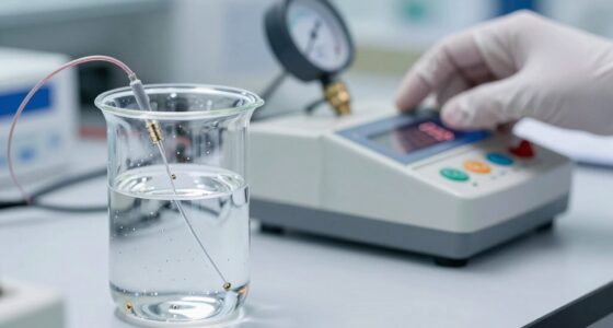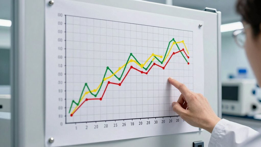

Control charts help you catch lab drift early by visualizing process stability over time. As you monitor data points against control limits, you can spot small, consistent shifts or trends that signal potential issues before they turn into failures. By recognizing early warning signs like points outside limits or gradual shifts, you can intervene promptly. Keep exploring to learn how to implement these practices effectively and maintain reliable, accurate lab results.

Get school and study supplies delivered free — and shop member deals
- Fast, free delivery on millions of items
- Access to Prime Big Deal Days deals on October 6–7
- Prime Video, Amazon Music and more included
Key Takeaways
- Control charts visualize process data to identify gradual shifts indicating potential lab drift early.
- They detect points outside control limits, signaling deviations before failure occurs.
- Trends or consistent small shifts in data suggest underlying process instability.
- Regular monitoring helps distinguish normal variability from true process changes.
- Early detection through control charts enables timely corrective actions to maintain accuracy.
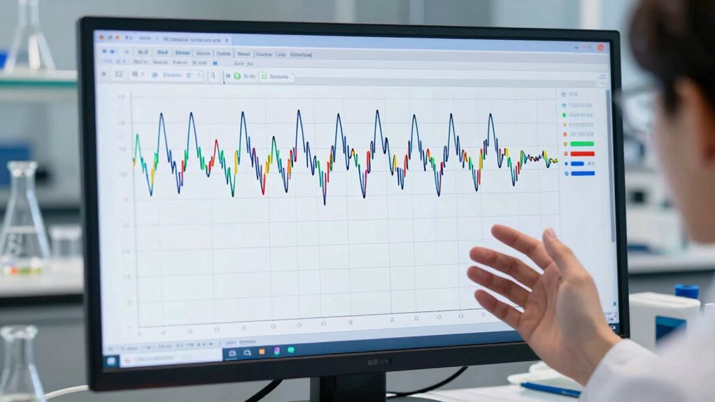
Control charts are essential tools for monitoring process stability and detecting variations over time, especially in laboratory settings. When you’re running tests or analyzing samples, understanding how your process behaves can be challenging. Sampling variability—the natural fluctuations that happen when you draw different samples—can obscure whether a shift in your data is a true change or just random noise. That’s where control charts come in. They help you distinguish between normal, expected variation and signs that your process is drifting out of control.
Control charts help distinguish true process shifts from natural sampling variability in lab testing.
As you use control charts, you gain the ability to see patterns that indicate potential lab drift before it turns into a failure. Small, consistent shifts in data points, or a series of points outside the control limits, act as early warning signs. These signals suggest your process might be losing stability, possibly due to equipment issues, reagent degradation, or procedural inconsistencies. By catching these signs early, you prevent minor deviations from escalating into significant errors, saving time, resources, and ensuring the accuracy of your lab results.
It’s important to recognize that some variation on your control chart is normal—sampling variability naturally causes fluctuations. Your goal isn’t to eliminate all variation but to understand what’s typical and what’s not. When you see data points suddenly trend upward or downward outside the expected range, it’s a red flag. These variations suggest that your process isn’t as stable as it should be, signaling the need for investigation or corrective action. Doing so helps you maintain the integrity of your results and keeps your lab running smoothly.
Control charts also empower you to monitor ongoing process stability, providing a visual representation of your data over time. When you track control limits and process averages, you develop a clearer picture of how your lab operates day-to-day. This continuous oversight allows you to identify subtle shifts early, rather than waiting until errors become obvious or corrective actions are more drastic. Regular review of your data can detect trends early, and understanding the typical sources of variation can help you implement more effective corrective actions. Recognizing process stability as a key concept helps you focus on maintaining consistent, reliable results over time. Additionally, fostering a culture of quality in your lab promotes proactive management of process variations and ensures ongoing compliance with standards.
As an affiliate, we earn on qualifying purchases.
Frequently Asked Questions
How Often Should Control Charts Be Updated for Optimal Accuracy?
You should update your control charts regularly, typically after each calibration or significant data collection period. The calibration frequency depends on your lab’s stability and data analysis techniques; more frequent updates enhance accuracy. By consistently reviewing data and adjusting control limits, you catch lab drift early. This proactive approach ensures your control charts remain reliable, helping you maintain quality and detect issues before they develop into failures.
What Are Common Signs of Lab Drift Before It Affects Results?
Think of lab drift like a slow leak in a tire—you might not notice at first, but subtle signs emerge. Common indicators include inconsistent control sample results, shifts in calibration frequency, or reagent stability issues. If you notice results slowly drifting outside control limits or increased variability, it’s a sign to check calibration routines and reagent quality. Addressing these early prevents bigger failures and maintains reliable lab output.
Can Control Charts Identify Specific Causes of Lab Drift?
Control charts can help you identify specific causes of lab drift through trend analysis, revealing patterns or shifts in your data. When you observe deviations or unusual trends, it prompts you to investigate further. By analyzing these patterns, you can trace back to root causes like equipment issues or procedural changes, enabling you to address problems proactively before they escalate into failures. Control charts are essential tools for pinpointing lab drift causes.
How Do Control Charts Differ Across Various Laboratory Testing Methods?
You’ll find that control charts differ across lab testing methods because of the unique data patterns and variability each method presents. Using method comparison helps you evaluate how different tests align, while chart customization allows you to tailor control limits and parameters suited for each technique. This guarantees your control charts accurately reflect the performance of each method, helping you detect drift early and maintain reliable results across diverse testing procedures.
What Training Is Needed for Staff to Effectively Interpret Control Charts?
You need thorough staff training on chart interpretation to master quality control. Think of it as opening a secret code that reveals lab health at a glance. Your team should learn to identify patterns, trends, and outliers on control charts confidently. Practical workshops, hands-on exercises, and ongoing education will enhance their skills, ensuring they catch issues early and maintain high standards. Clear understanding transforms complex data into actionable insights.
Conclusion
Think of control charts as your lab’s early warning system, like a smoke detector that alerts you before a fire erupts. I once saw a lab catch subtle shifts in measurements early, preventing costly errors. Just as catching smoke early keeps a fire from spreading, monitoring lab drift with control charts helps you intervene before quality fails. Keep an eye on those charts, and you’ll catch problems before they become disasters.
Halloween Picks
halloween
As an affiliate, we earn on qualifying purchases.